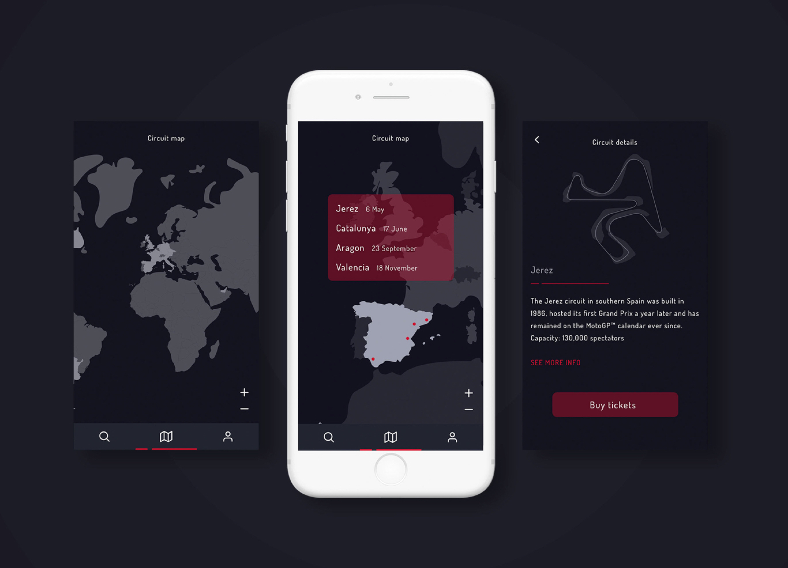
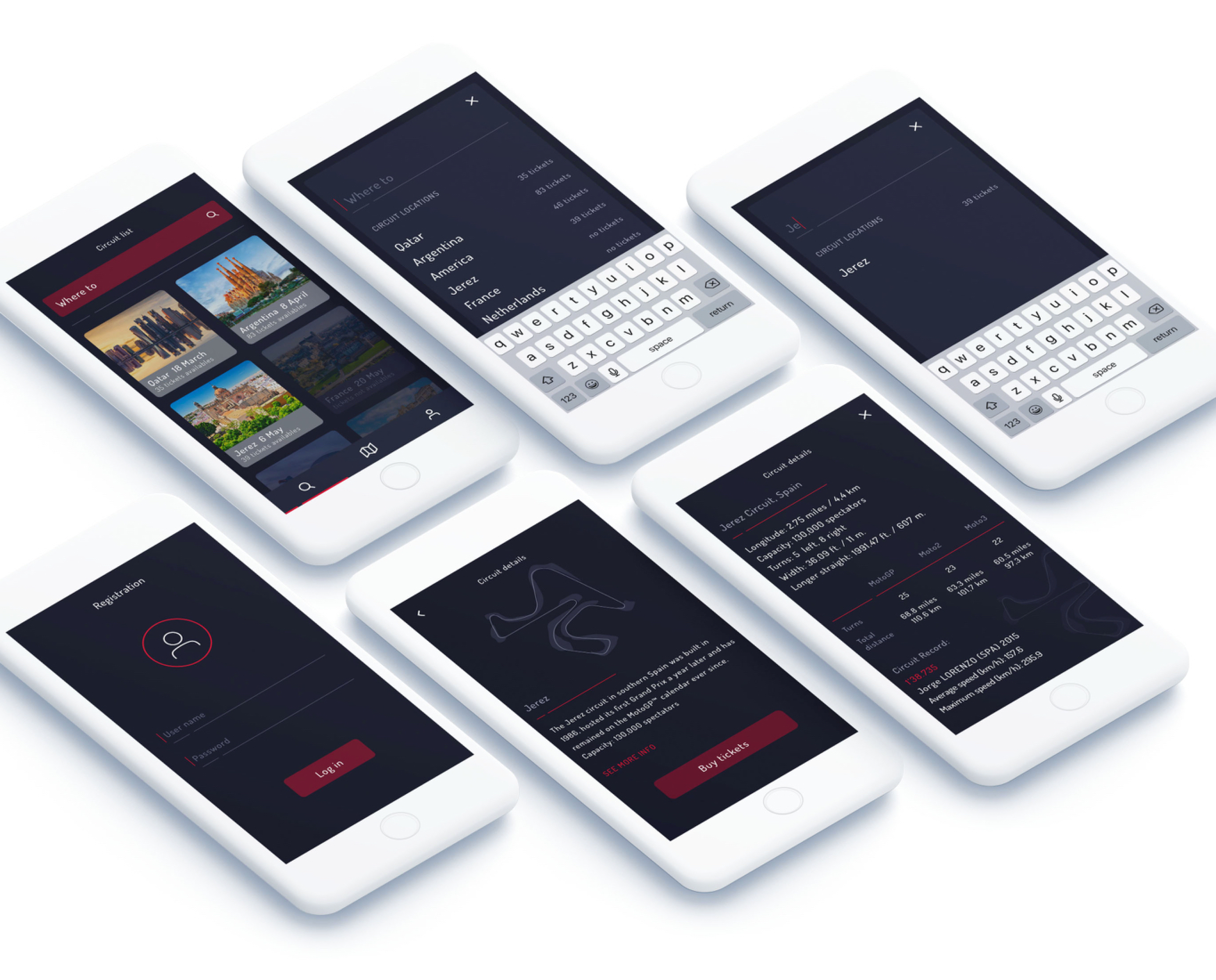
UI/UX design concept of Motick App interface. I decided to imagine how it could be an application to buy tickets for the MotoGP World Championship. With this application you can navigate through an interactive map to locate the circuits of the world. You can find information about circuits and buy tickets, save them in your profile and use them when you want from any device. This is the result.

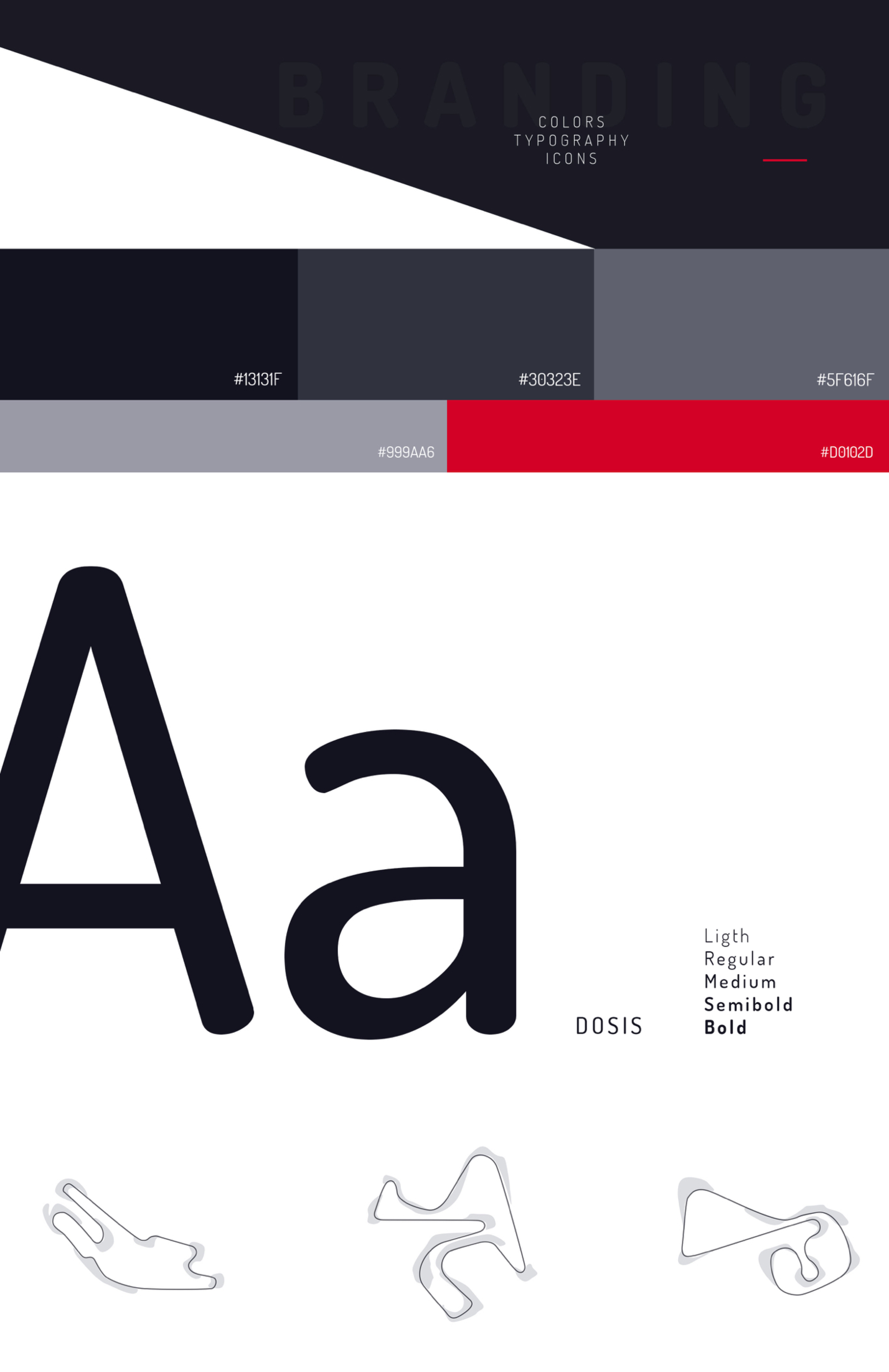
For the design I used dark colors like blacks and grays, with touches of red, colors characteristic of this sport. In the app you can see my illustrations of the circuits. If you want to see the interactions I did with Principle for the app visit the project in Behance.

